
The app's first critic
I started using Camaïeu soon after launch. Not testing it, using it. When the afternoon gets heavy, I open it, breathe along with the ring for a minute or two, and close it. A quick shot of Camaïeu that feels like a healthy little break.
It also made me the app's first critic. Coming back to it regularly, without a task, I kept noticing the same thing: there was too much on screen. A circle to pick the mode, a viewfinder button, a checkmark to leave compose, panels that opened on top of other panels. Every control felt right when I added it. Together, they made a small room feel crowded, and a breathing app should not feel crowded.
So the next update rebuilds the chrome around three modes: compose, breathe, timer. One switch at the bottom, and each mode replaces everything above it. Nothing stacks anymore. Compose is where a picture is made, with the colors, the family, the framing. Breathe and timer are where it is used, and each one asks exactly one question (which pattern, or how long), then starts.
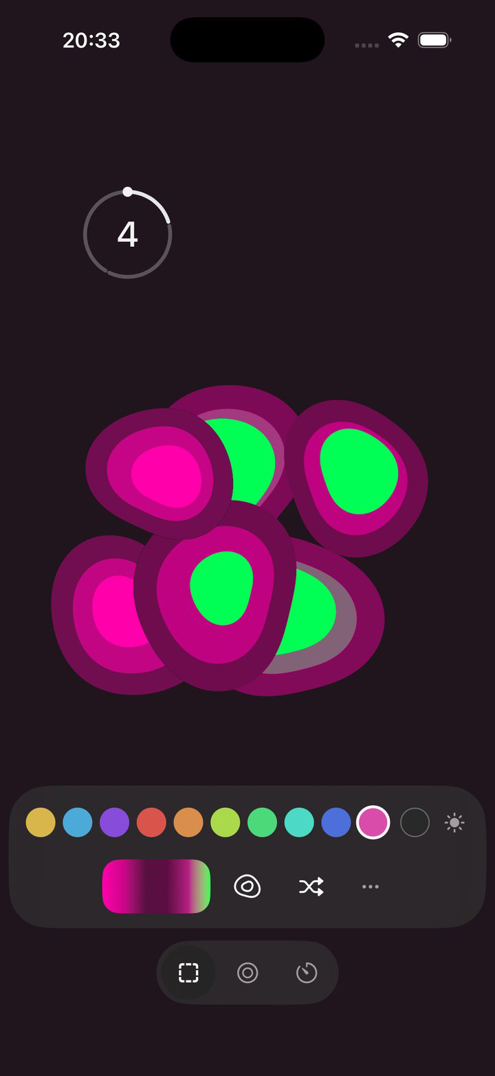
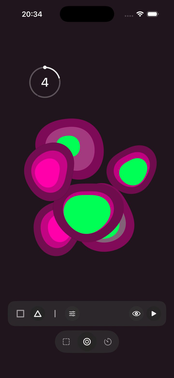
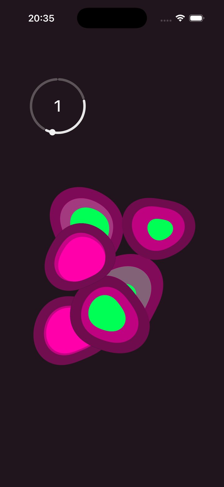
One consequence I like: a saved look now remembers what it was for. Recall a favorite and you land in its mode, with the ring or the countdown where you placed it. It also remembers its light or dark appearance and its screen brightness, because both change how the colors read, and a picture that looks different every time you open it is not really saved.
And one small thing that annoyed me when using it: the appearance dot used to cycle through light, system, and dark, so going from light to dark took two taps and felt like a bug. It is light or dark now. Simpler, one less thing to explain.
The rework lives on a branch and will ship before Shipaton closes.
Camaïeu is built for RevenueCat's Shipaton 2026. #Shipaton #BuildInPublic